CSS fix for 100vh in mobile WebKit
Not long ago there was some buzz around how WebKit handles 100vh in CSS, essentially ignoring the bottom edge of the browser viewport. Some have suggested not using 100vh, others have come up with different alternatives to work around the problem. In fact, this issue goes further back a few years when Nicolas Hoizey filed a bug with WebKit on the subject (the short of it: WebKit says this is “intentional” 🧐).
The other day I was doing some work with a basic flexbox layout – header, main, sticky footer – the kind we’ve all seen and used many times before:
<body>
  <header>HEADER GOES HERE</header>
  <main>MAIN GOES HERE</main>
  <footer>FOOTER GOES HERE</footer>
</body>
body {
  display: flex;
  flex-direction: column;
  margin: 0;
  min-height: 100vh;
}

main {
  flex: 1;
}
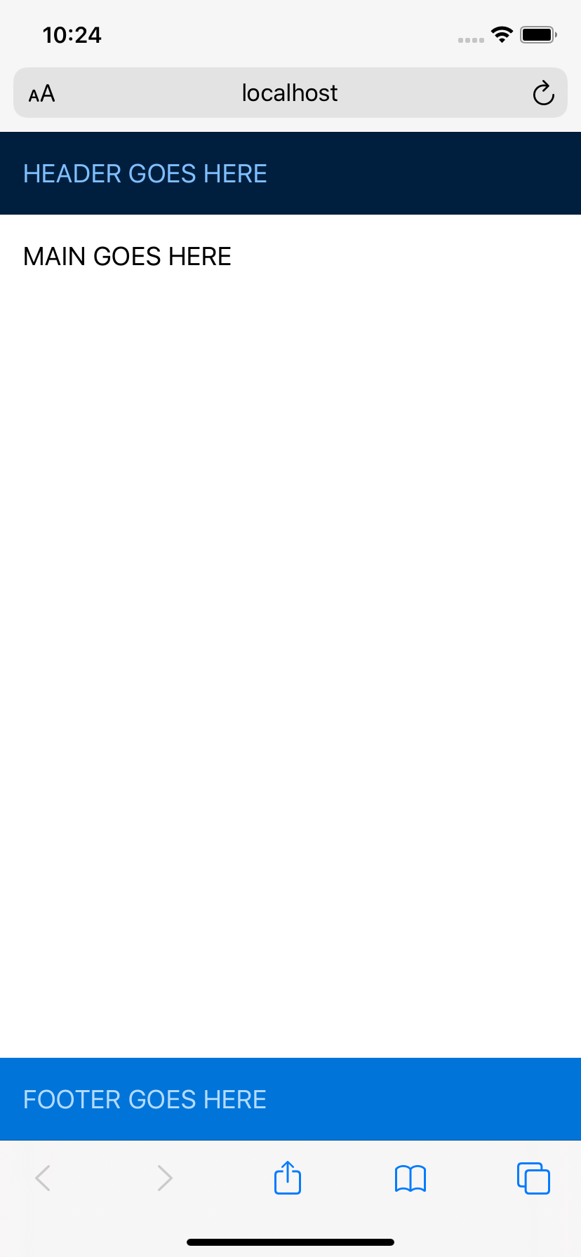
I began running some browser tests on my iPhone, and that’s when I noticed that my sticky footer wasn’t looking so sticky:
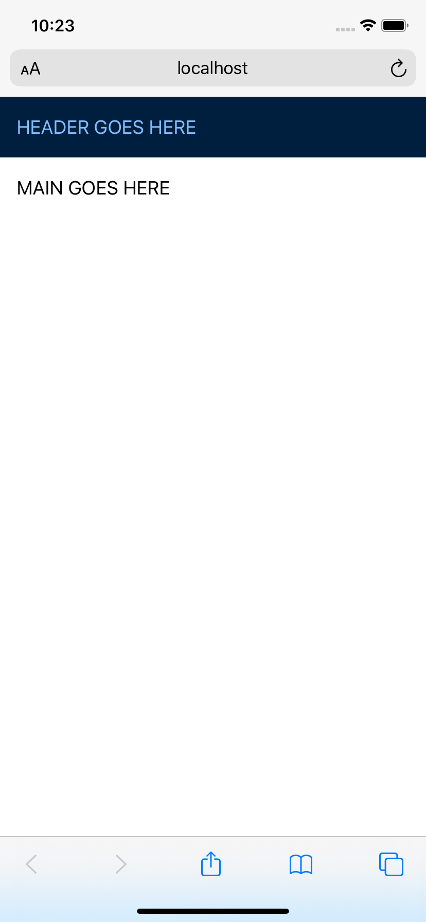
The footer was hiding below Safari’s menu bar. This is the 100vh bug (feature?) that Nicolas originally uncovered and reported. I did a little sleuthing – hoping that maybe by now a non-hacky fix had been found – and that’s when I stumbled upon my own solution (btw, it’s totally hacky):
Using -webkit-fill-available
The idea behind -webkit-fill-available – at least at one point – was to allow for an element to intrinsically fit into a particular layout, i.e., fill the available space for that property. At the moment intrinsic values like this aren’t fully supported by the CSSWG.
However, the above problem is specifically in WebKit, which does support -webkit-fill-available. So with that in mind, I added it to my ruleset with 100vh as the fallback for all other browsers.
body {
  min-height: 100vh;
  /* mobile viewport bug fix */
  min-height: -webkit-fill-available;
}

html {
  height: -webkit-fill-available;
}
And now the sticky footer is right where I want it to be in mobile Safari!
Does this really work?
The jury seems to be out on this. I’ve had no problems with any of the tests I’ve run and I’m using this method in production right now. But I did receive a number of responses to my tweet pointing to other possible problems with using this (e.g., the effect on rotating devices, Chrome not completely ignoring the property, etc.).
Will -webkit-fill-available work in every scenario? Probably not, cuz let’s be honest: this is the web, and it can be damn hard to build. But, if you’re having a problem with 100vh in WebKit and you’re looking for a CSS alternative, you might want to try this.